

Enhancing User Experience on Paramount Plus
My role: Lead UX/UI Designer responsible for user research, interface design, and prototyping.
Industry: Entertainment sector/streaming services
Toolkit : Figma, Illustrator and photoshop.
Timeline : October 2024 – November 2024
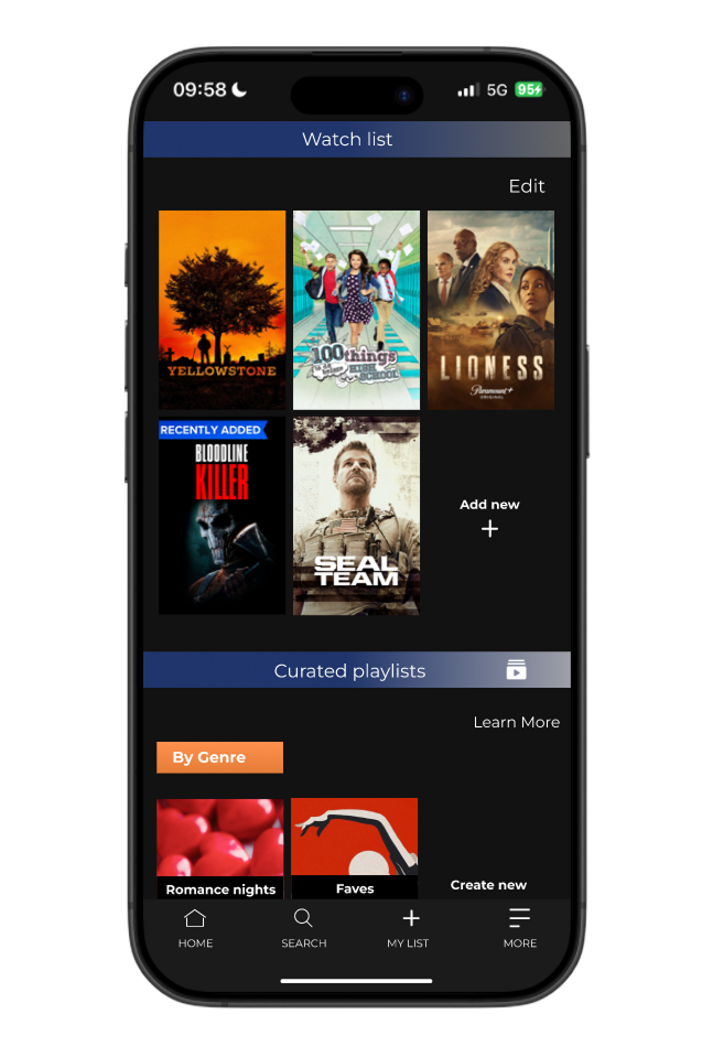
Project scope: The goal of this project was to design and integrate a personalized playlist feature within Paramount Plus, enhancing user engagement and content organization without disrupting the platform’s existing structure.


Solving Personalization Gaps in Paramount+
81% of viewers expect streaming services to provide highly personalized experiences, highlighting the demand for tailored content recommendations. Google Cloud
Almost 50% of consumers would spend more time on streaming platforms if content discovery were easier, indicating that improved personalization can lead to increased viewer retention. Deloitte
"I just want to group my comfort shows or share a playlist for a weekend binge — why can’t I do that?"
– User interview participant

Understanding User Behaviour to Drive Better Design
To understand how users navigate Paramount Plus, what challenges they face, and how the experience could be improved across devices, I conducted competitor analysis, surveys, user interviews, and card sorting to gather both qualitative and quantitative insights that would inform the design of a more intuitive and personalized navigation experience.
What we discovered...
1. Personalization was missing and expected
Source: Interviews
Users wanted playlists that matched their viewing moods (e.g. relaxing, nostalgic, scary) or themes (e.g. "Girls Night", "90s Throwbacks"). This highlighted a gap in emotional connection and content curation.
2. Content discovery felt passive and overwhelming
Source: Surveys
Over 60% of users said they felt overwhelmed while browsing, often scrolling without making a choice. This revealed a need for smarter grouping and better organization.
3. Competitor platforms offer stronger list curation
Source: Competitive analysis
Compared to Netflix and Disney+, Paramount+ lacked flexible list-building tools and personalization. Users felt other platforms better understood their habits.
Summary :
These insights made it clear: users don’t just want to save content, they want to organize it in meaningful ways that reflect their emotions, routines, and viewing habits. This understanding directly shaped our playlist feature design.
The Personas That Mapped Our Priorities

Name: Rayla
Age: 26
Occupation: Graphic Designer
Location: Manchester, UK
Streaming Habits: Spontaneous viewer who browses often and watches based on mood or visual appeal
“Sometimes I just want to vibe with something chill or artsy, but My List is a mess. I can’t find anything unless I remember what I saved.”
Goal : Enjoy playlists or themes that match her mood (e.g. “Feel-good Comedies,” “Powerful Women Leads”)
Needs : A system that feels intuitive and inspiring, not cluttered or overwhelming
Motivation:
Streaming helps her relax after work or while multitasking (drawing, editing)
Frustrations : Wishes she could create different “mood playlists” instead of saving everything to one big list

Name: Jason
Age: 29
Occupation: Freelance Developer
Location: UK
Streaming Habits: Watches shows late at night or with friends; switches between Netflix, Hulu, and Paramount+.
“I want to easily share my playlist for movie nights right now I just text links or forget what I saved.”
Goal : Wants a platform which features nostalgic content , which is reliable and easy to navigate
Needs : Jason need a platform where he can watch content with his friends remotely
Motivation:
To make the most of his subscription and share shows with friends
Frustrations : He isn't sure whether to keep his subscription because the platform doesn't offer latest shows or up to date season he’s often frustrated because of this
Summary
Designing for Jason and Rayla revealed both the emotional disconnect and practical frustrations within the current experience helping us prioritize features that brought clarity, control, and personal meaning to how users engage with content.
Framing the Challenges: Designing for Jason & Rayla
1. How might we help users like Jason and Rayla organize their saved content in ways that reflect their mood, habits, and intentions, without adding friction?
2. How might we enable users to manage multiple playlists that feel personal and emotionally relevant, while maintaining ease and clarity across devices?
3. How might we give users the option to share playlists in a way that supports social viewing, while keeping control over privacy and content access?
Proposed Solutions:

Add While Browsing:
Reduces friction in navigation and supports Jason’s need for efficiency.

Tagging System:
Helps users like Rayla organize content by tone or vibe, enhancing discoverability.
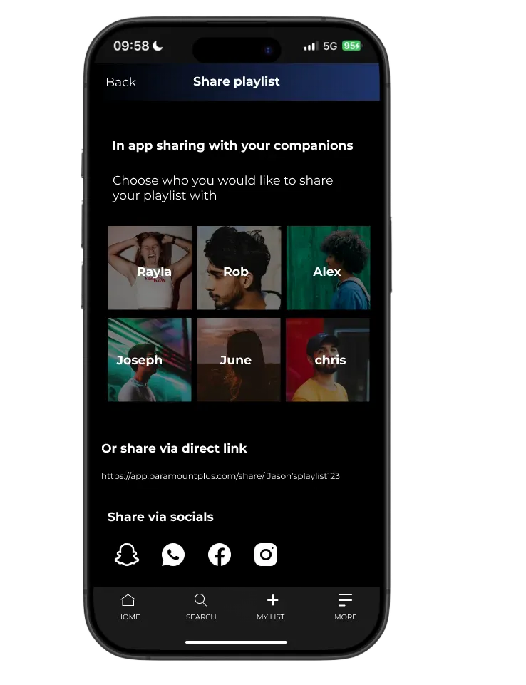
Sharing Options:
Supports Jason’s need to share playlists without compromising privacy.
What we learned from users
After building high-fidelity prototypes, I conducted usability testing sessions with three participants representing our primary personas. The goal was to validate the clarity, flow, and usability of the new playlist feature and uncover areas that needed refinement.
Feedback playlist confusion:
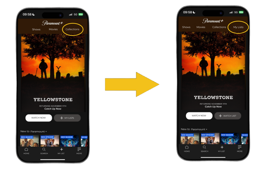
Users were unclear about the difference between “My List” and the new playlist feature.
We renamed the top navigation item from “Collections” to “My Lists” and aligned the button label beneath the featured content to match. This improved clarity and created a consistent mental model for users navigating their playlists.
Iteration:
Feedback playlist settings:
“Playlist Access” and “Privacy Settings” sounded too similar, causing hesitation during sharing.
We combined and renamed both options under a single, clearer label: “Playlist Sharing Permissions.” This simplified the interface and made it immediately obvious that users were controlling who could view or collaborate on their playlists.
Iteration:

From Insight to Impact
What I learned
This project taught me the value of thoughtful simplicity; how even small tweaks in wording, flow, or structure can deeply impact a user’s confidence and ease of use. I learned how essential it is to make new features feel familiar; integrating playlists into the existing Paramount+ experience without overwhelming users.
Next steps
While the MVP successfully solved core personalization and usability challenges, there are future opportunities to deepen engagement and streamline the experience further: